


The Role of Color Psychology in Condo Interior Design


Color does more than change how your condo looks—it shapes how you feel, move through a space, and interact with others. From wall shades to furniture tones and small décor details, every hue influences your mood and energy.
That’s why every color choice counts in a condo, where space is compact. Harnessing color psychology allows you to turn limited square footage into a home that supports your lifestyle.
This guide will teach you how different hues guide your choices in each room, and how to implement color that reflects your personality and sense of well-being.
Color Psychology Explained
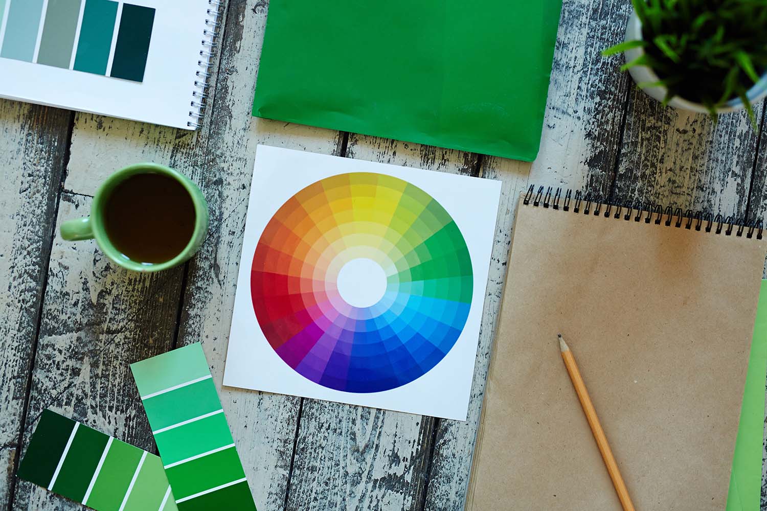
Color psychology studies how color influences human emotion, perception, and behavior. Scientists and designers have found that hues affect energy levels, focus, and decision-making. In interior design, color goes beyond decoration—it sets the tone of a space and can improve your quality of life.
Applying color psychology starts with understanding the purpose of each space. Bedrooms are for relaxation, kitchens for stimulation, and living areas for a balance of both. When you understand color psychology for rooms, you can choose shades that match your routine, support your mood, and reflect your personality.
Color also changes how you experience space. Thoughtful combinations can make a small condo feel larger, create flow between open areas, and define multifunctional zones. Using color deliberately transforms your condo into a space that’s cohesive and functional.
Color Psychology in Interior Design: How Hues Affect Your Mood
Every color tells a story, and the walls around you are canvases. With color psychology in interior design, you can use those stories to shape how each room feels and functions. The same shade can soothe, energize, or inspire depending on where and how you use it.
1. Red
Red is a high-energy color that increases heart rate and stimulates attention. It promotes appetite, encourages social interaction, and can even trigger a sense of urgency. It works best in spaces where you want energy and engagement, such as dining rooms and kitchens.
On the other hand, avoid large expanses of red on walls in small spaces, as it can feel aggressive. This color pairs well with neutral tones like beige or gray to temper intensity while maintaining vibrancy.
2. Yellow
Yellow evokes optimism, creativity, and warmth. Lighter, muted yellows can make a space feel sunny and uplifting without overwhelming the senses. In kitchens and study corners, yellow encourages alertness and creative thinking.
Meanwhile, deeper, mustard tones bring sophistication but may reduce brightness in poorly lit rooms. Yellow is highly sensitive to light conditions, so consider how sunlight interacts with the walls at different times of the day.
3. Blue
Research in environmental psychology shows that blue can lower stress levels, reduce anxiety, and improve concentration.
In interior design, lighter blues expand visual space, making small condos feel more open. Meanwhile, navy or indigo brings a sense of stability and depth to offices or bedrooms. Blue pairs well with warm wood tones, creams, and soft grays for a balanced, serene environment.
4. Orange
Orange increases energy and promotes socialization. It’s less aggressive than red but still stimulates warmth and enthusiasm. Orange accents work well in living areas, informal lounges, and multipurpose rooms.
However, avoid painting entire walls orange in compact condos; the color can dominate and feel oppressive. Consider opting for soft terracotta or muted peach shades to create an inviting atmosphere without overwhelming the senses.
5. Green
Green is associated with balance, restoration, and comfort. Biologically, humans respond positively to natural tones, which may explain why green is associated with reduced stress and increased relaxation. Bedrooms, study areas, or indoor plant corners are ideal spaces for greenery.
Pairing this color with natural elements like wood, stone, or live plants enhances its calming effect. You can use olive, sage, or forest green tones for depth, as bright lime shades may feel too energizing for restful spaces.
6. Purple
Purple has a dual nature: lighter lavender tones calm and soothe, while deeper violet shades convey luxury and creativity. Historically, it’s been linked with royalty and sophistication—a connection that still shapes how people perceive the color today.
Use purple in bedrooms, reading nooks, or creative studios to inspire focus and relaxation. Pair it with neutrals or metallic accents to add richness without visual heaviness.
7. Black
Black brings grounding and sophistication, giving any space a sense of depth and definition. It fits naturally in minimalist or modern condo interiors where clean lines and contrast matter.
When you use this color through furniture, frames, or décor accents, it adds structure and focus to a room. But too much of it can make a small space feel closed in, so balance is key. Pair it with lighter neutrals or metallic touches to keep the room airy while maintaining that sleek, refined look.
8. White
White evokes clarity, openness, and neutrality. It reflects light to make small condos feel more spacious.
While white furniture, cabinetry, and trim create a clean backdrop that highlights accent colors, pure white can feel sterile. So, pair it with warm neutrals or textured materials like wood, fabric, or stone to add depth and warmth.
9. Pink
Pink evokes calmness, warmth, and nurturing feelings. That’s why soft shades are ideal for bedrooms or bathrooms. Brighter pinks energize accents or furniture, creating playful yet sophisticated spots of interest. You can pair pink with muted neutrals like gray or cream to maintain balance.
Tips for Effective Color Psychology in Interior Design
Applying color theory in interior design means making intentional choices. Here are some ways to create a cohesive and meaningful space:
1. Consider the room’s purpose
Every room has a primary function, and its color should reflect that. Bedrooms call for calming tones like soft blues or muted greens to promote rest. Living areas thrive with warm, welcoming hues that encourage connection, while kitchens and home offices suit energetic shades like yellow or red to boost focus and activity.
That said, choose colors that align with each room’s purpose to make them feel intentional and functional.
2. Think about natural light
Sunlight transforms color perception. North-facing rooms feel cooler and may need warmer shades to feel welcoming, while south-facing rooms amplify warmth and can support cooler tones.
Observe how color shifts throughout the day before making long-term choices.
3. Incorporate accent colors strategically
Bold colors can energize or focus attention, but too much can overpower a room. So, consider using them through furniture, cushions, artwork, or rugs. These accents create visual focus and make it easy to refresh your décor with new trends or seasons.
4. Stick with contemporary colors
Start with neutral, muted tones to create a timeless foundation. Shades like beige, grey, or off-white make your condo feel more open and let accent colors stand out without overwhelming the space.
5. Assess personal preferences
Your condo should reflect your personality. Consider which shades naturally make you feel energized, relaxed, or focused. Personal preference can override general color psychology rules, so balance scientific guidance with what truly works for you.
6. Test how combinations of colors work before committing
Use paint swatches, sample boards, or digital design tools to visualize interactions. See how colors look together in different lighting and on various surfaces. Small experiments help you avoid costly mistakes and achieve a cohesive look.
7. Understand the emotional impact
Warm tones can energize, while cool tones promote calm. Still, personal responses to different colors vary—pay attention to how your palette influences your mood, focus, and interactions, then adjust accordingly.
Shaping Better Spaces Through Color
Color shapes the way you experience your condo. When you use color psychology well, you can turn compact spaces into calm retreats or energizing hubs. Every hue carries meaning, and understanding these associations helps you design interiors that support your lifestyle.
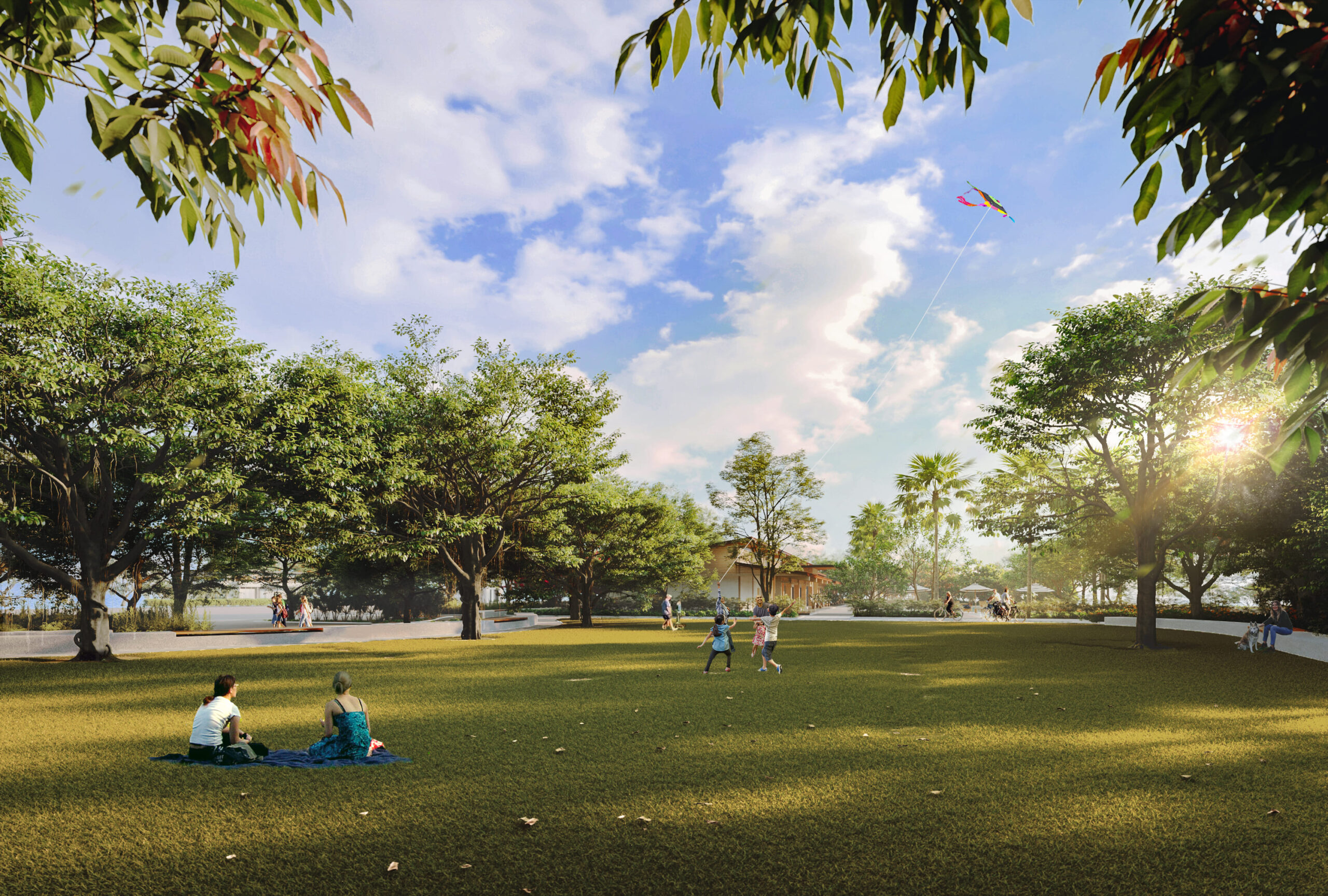
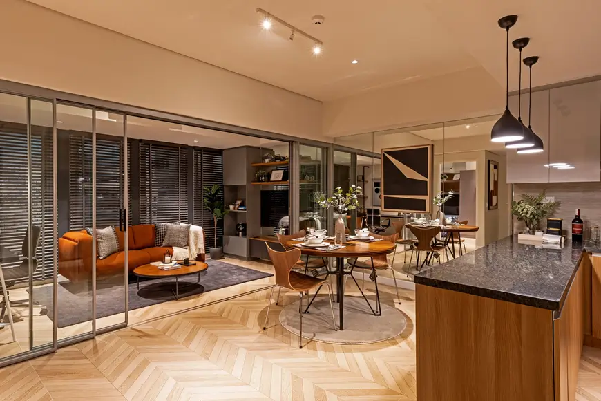
Federal Land, Inc. brings these principles to life through its properties, like Quantum Residences, a pre-selling condo in Pasay. Nestled at the crossroads of Taft and Buendia, this condo blends a prime location with modern amenities and flexible layouts ideal for young professionals.
You can personalize finishes and palettes to mirror your personality while enjoying efficient, thoughtful design.
Create a vibrant, purposeful home that supports how you live and feel. Visit Federal Land to learn more and secure your unit today.
FAQs About Color Psychology in Condo Interior Design
Learn more about color psychology for your condo interior design with these frequently asked questions below:
1. What is color psychology in interior design?
It’s the study of how colors influence mood, perception, and behavior. In condos, applying color psychology helps maximize comfort, energy, and functionality.
2. Which colors make a condo feel bigger?
Light shades such as white, cream, and pale blue reflect light and create the impression of a more open and spacious area.
3. What colors are best for relaxing spaces like bedrooms?
Cool hues such as soft blue, muted green, or lavender promote rest, balance, and calmness, making them ideal for bedrooms or quiet corners.
4. How can I use bold colors in a small condo without overwhelming it?
Introduce bold tones through accents such as cushions, rugs, furniture, or artwork. This way, you can add energy and focus without making the space feel cramped.
5. Why should I match color to a room’s function?
Each room serves a specific purpose. Red or yellow can energize kitchens and dining areas, while blue and green create a calming effect in bedrooms and living rooms.

Digital Marketing Head
Martin is an experienced marketer with over 16 years of experience across various industries including real estate, banking and finance, technology, and advertising.
Martin has a broad range of expertise in having handled campaigns, brand launches, activations both in the traditional and digital space. Currently serving as the Digital Marketing Head at Federal Land, Martin leads a team focused on managing digital sales and platforms for the residential, estates and commercial business units.
linkedinINQUIRE NOW
Let us know what you are looking for. Get updated portfolio delivered straight to your inbox.